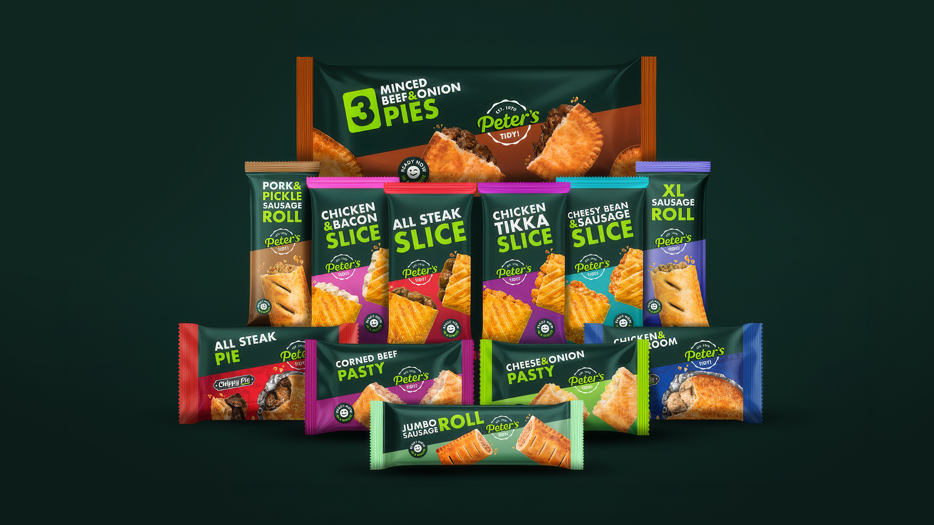
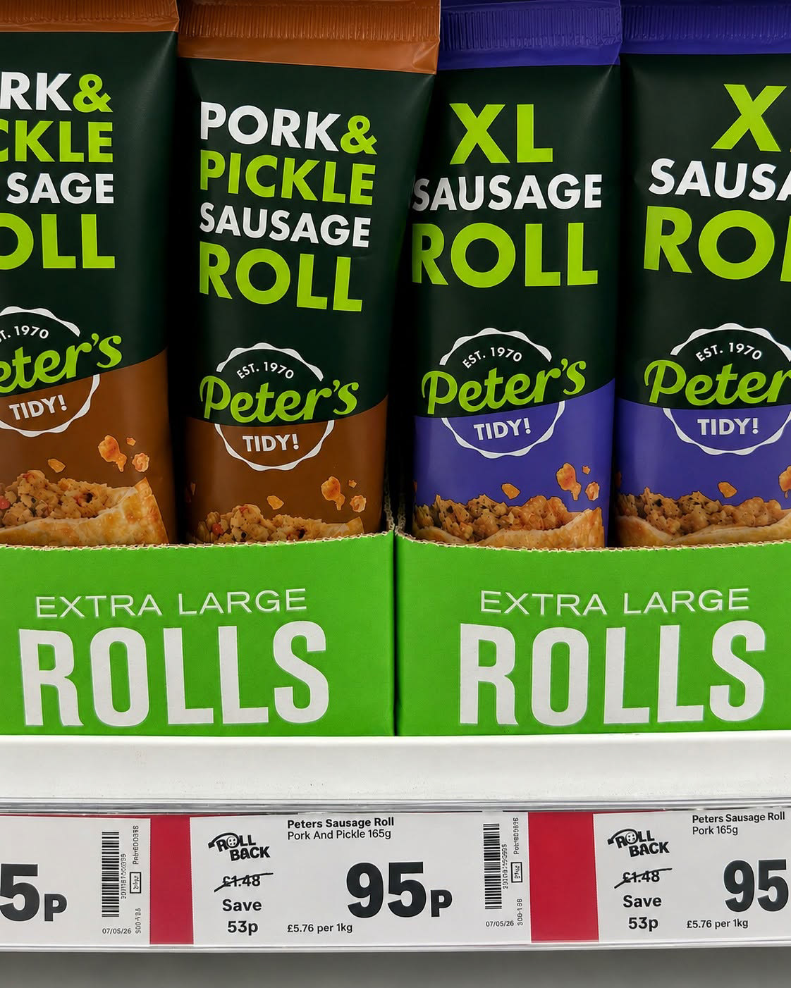
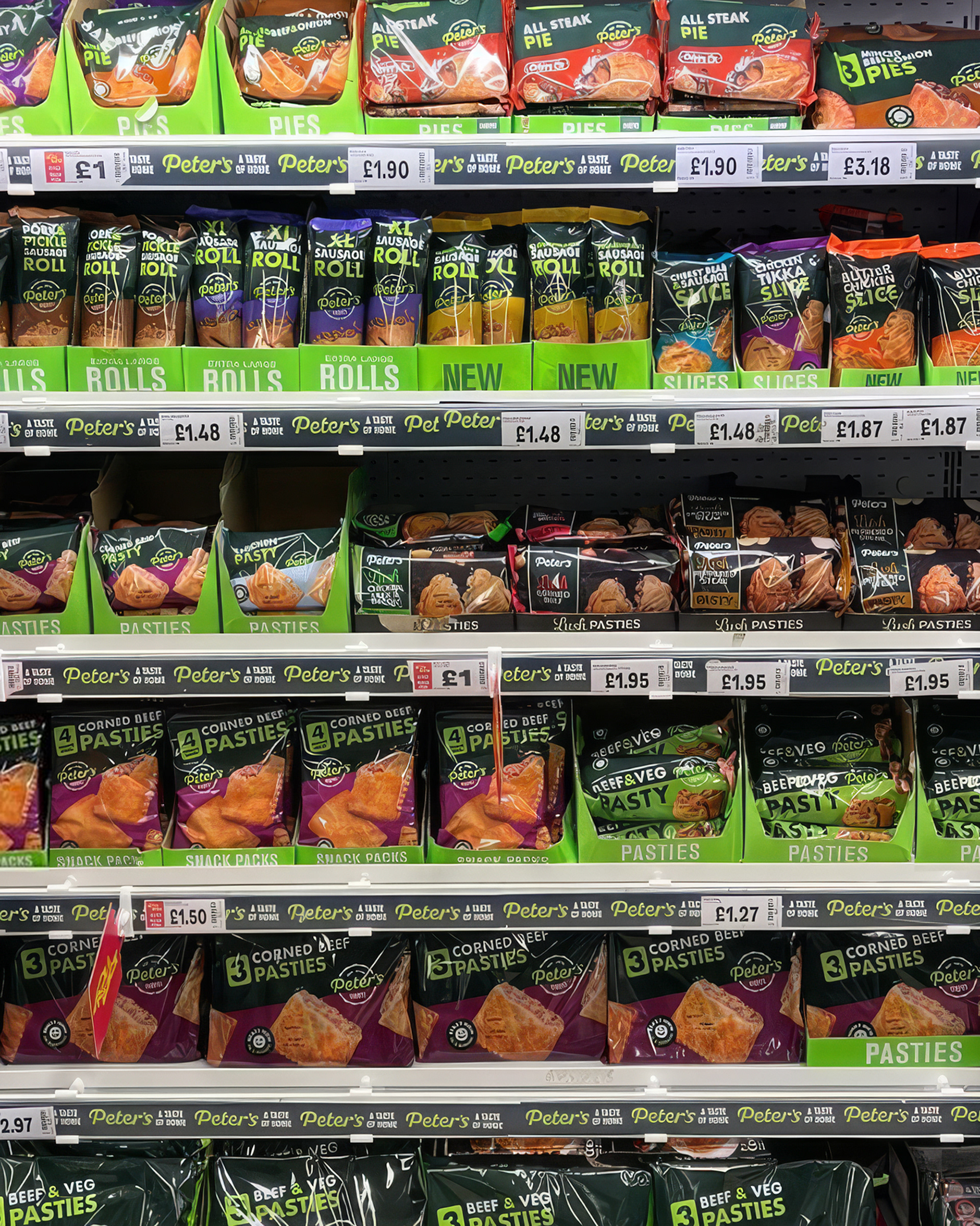
The work helped carry Peter’s new look across a large and varied product family, creating stronger shelf impact without losing the familiarity of a much-loved Welsh food brand. Bold colour coding, clearer product hierarchy and the ‘TIDY!’ personality gave the range a more confident, consistent presence.
A flexible range architecture brought pies, slices, sausage rolls and pasties together while allowing individual flavours and formats to stay easy to navigate.
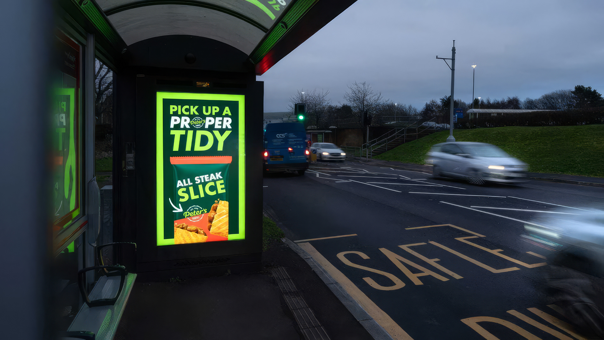
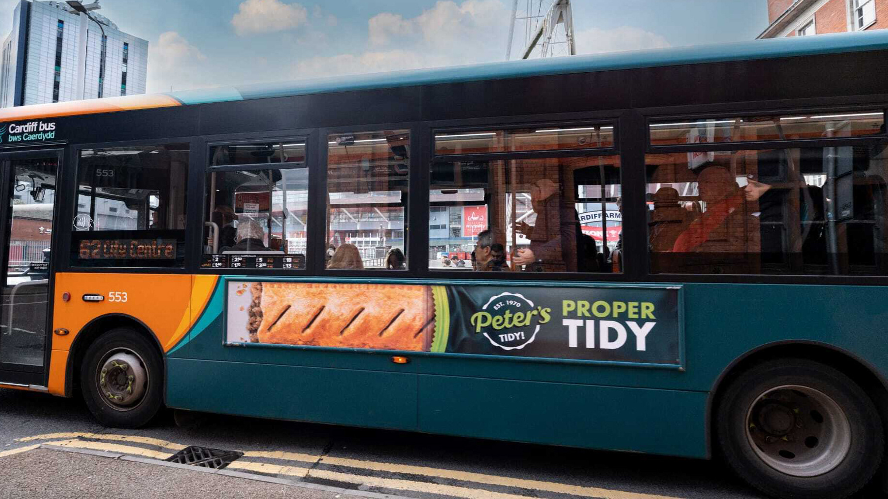
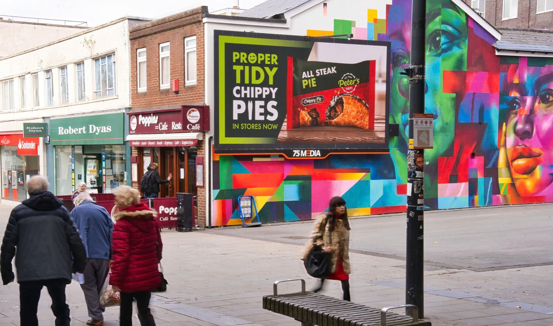
The packaging language extended naturally into shelf-ready trays, retail displays, bus sides and roadside formats, keeping product recognition at the centre.
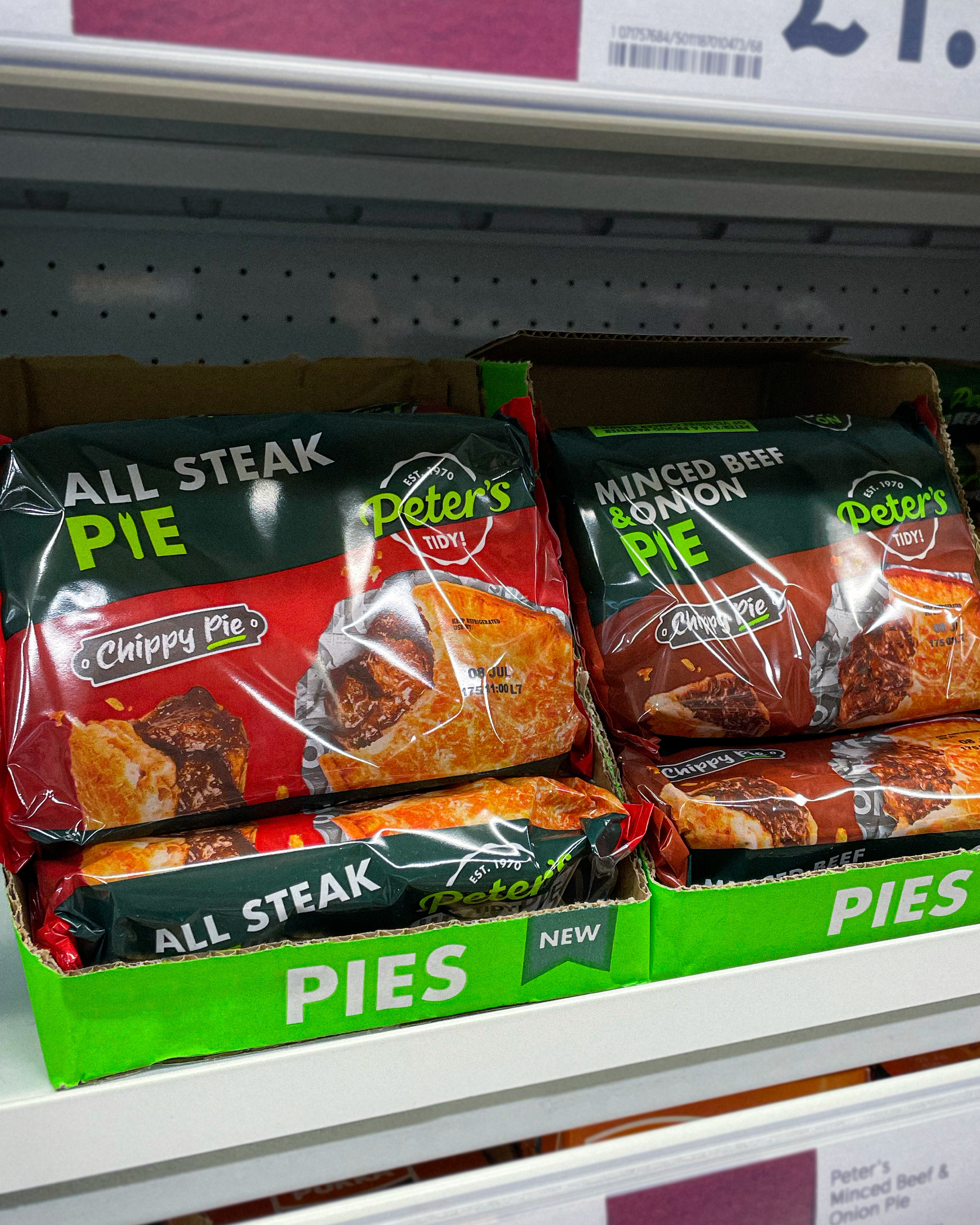
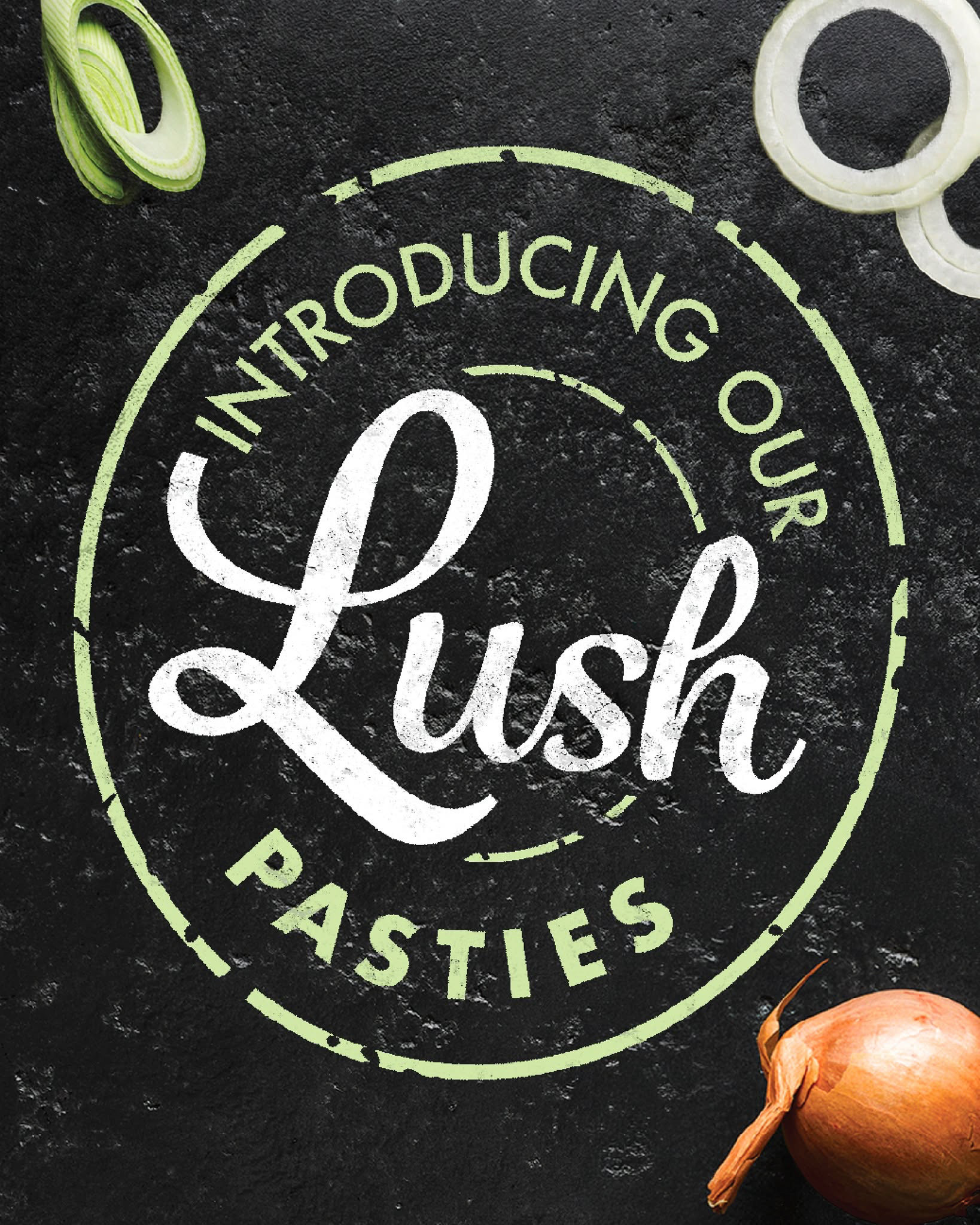
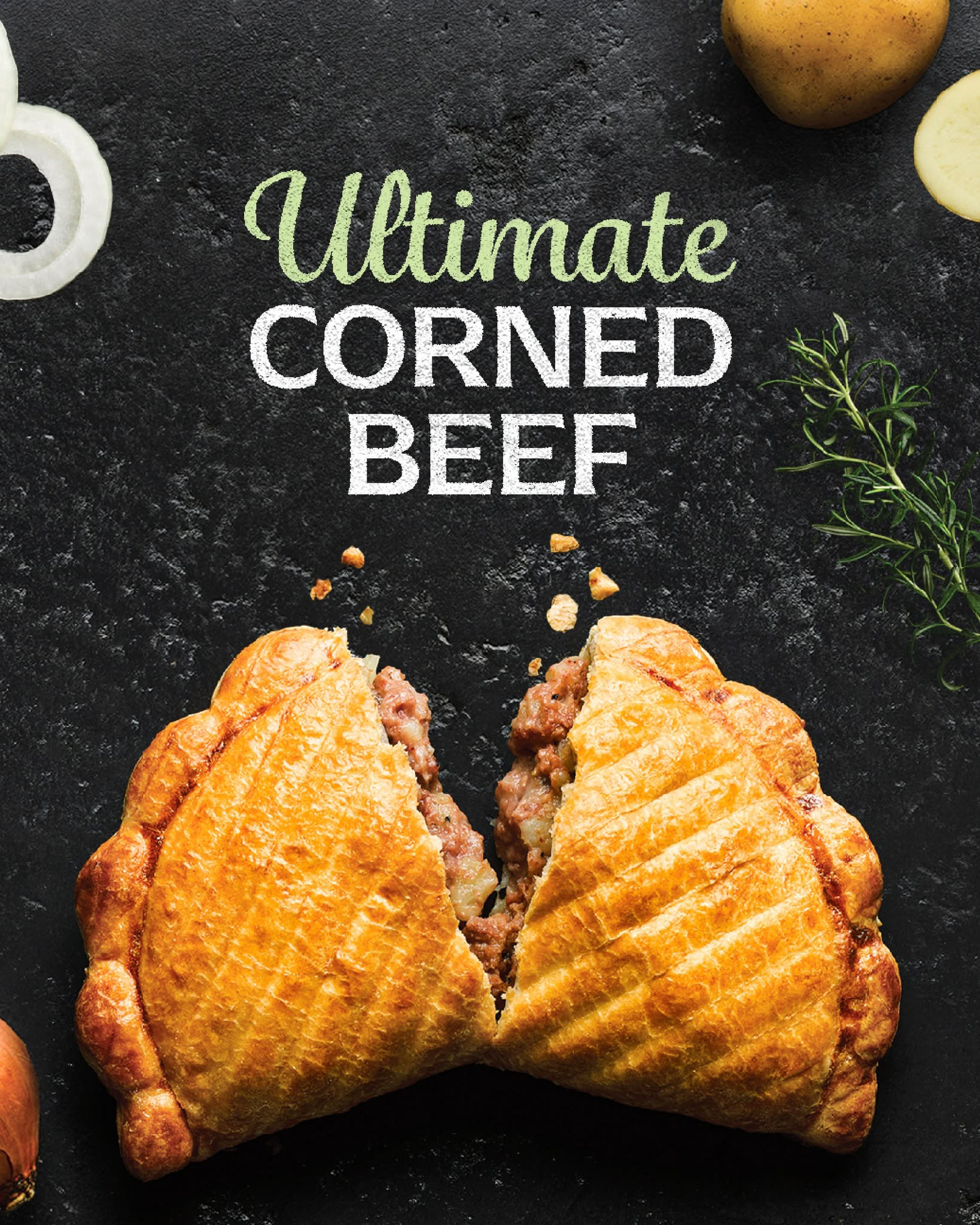
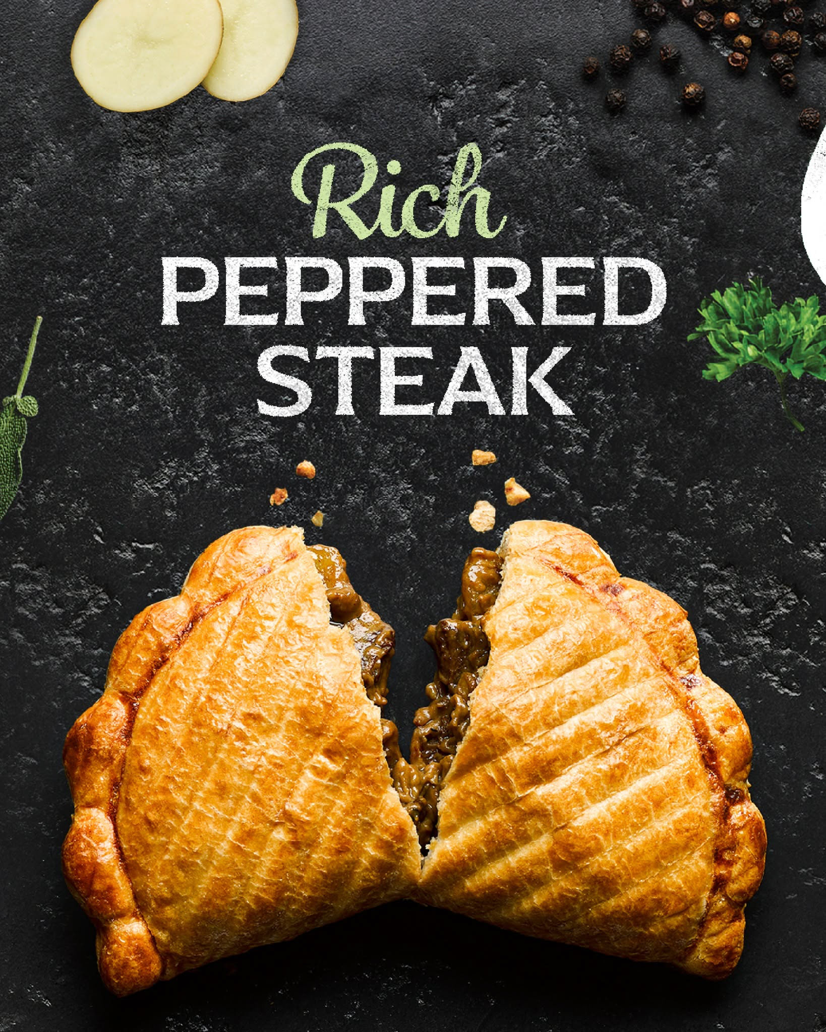
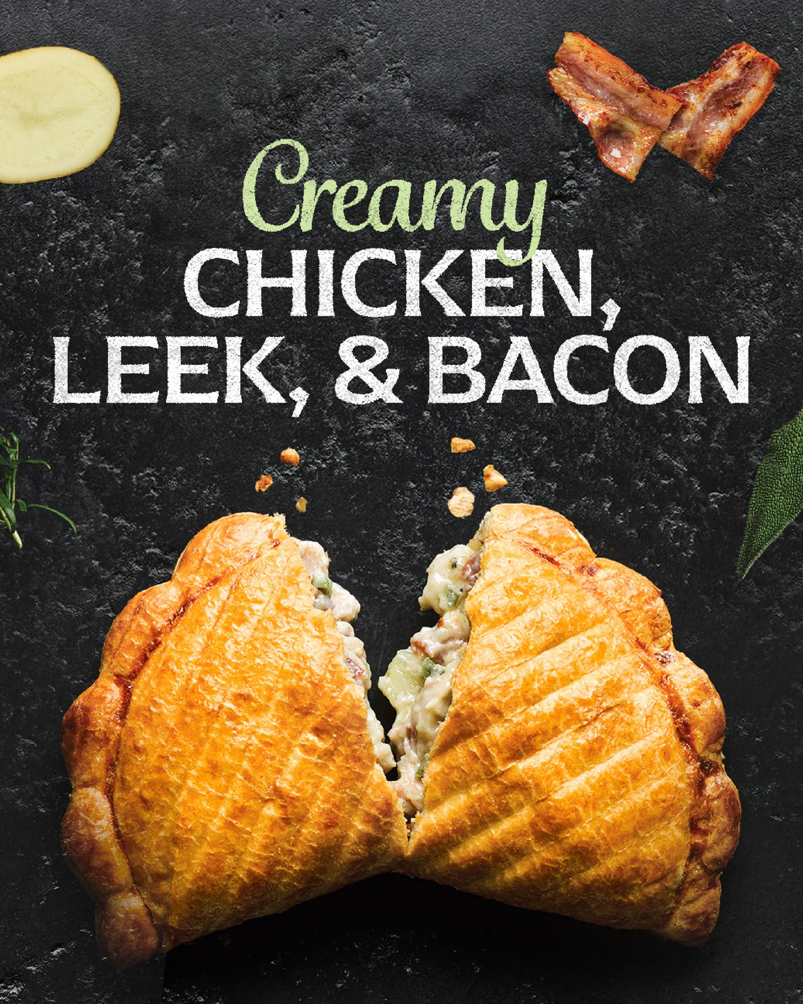
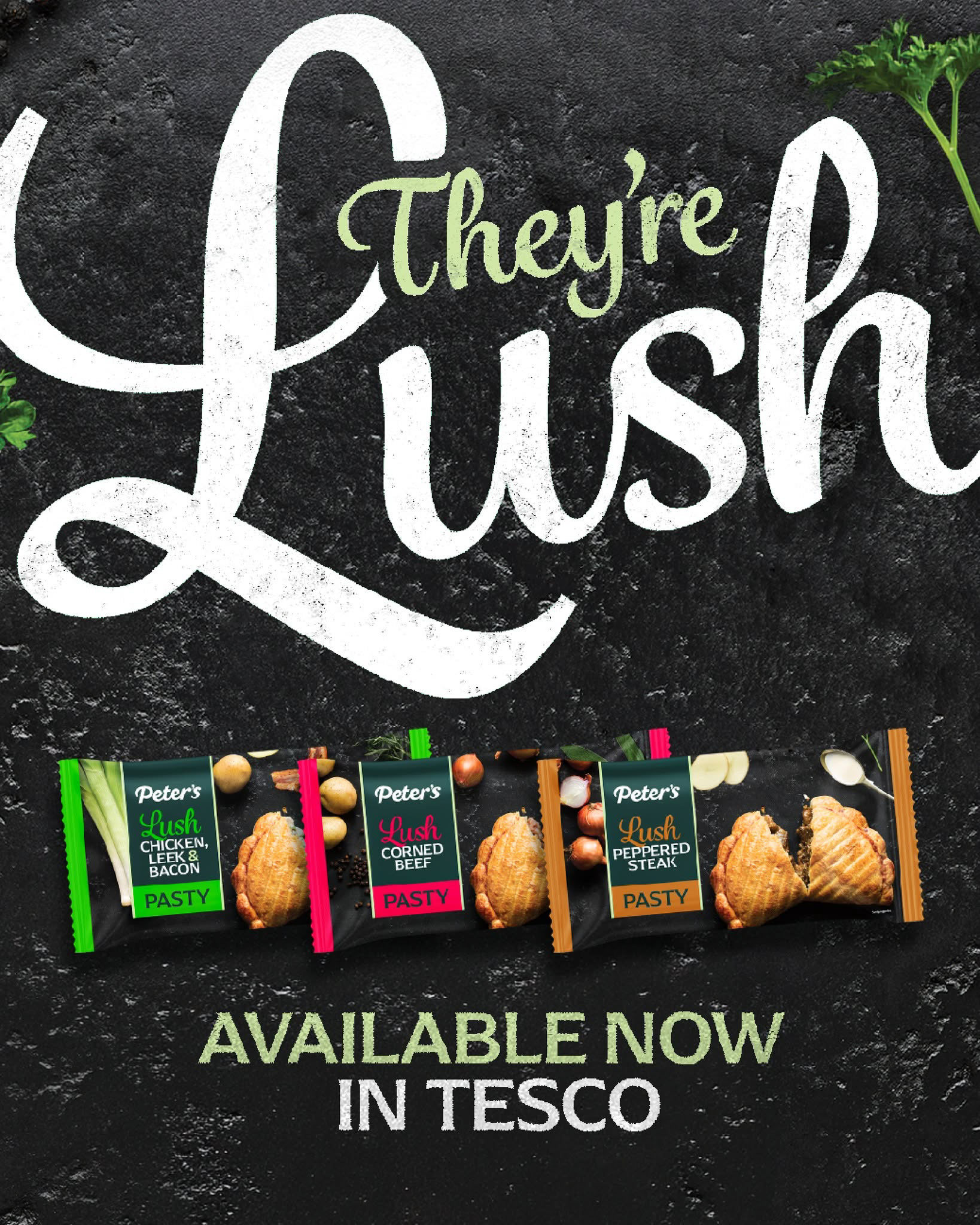
Supporting social and product campaigns, including the Lush pasty range, used close food imagery and expressive typography to build appetite and personality.